All work
Brand identity / Therapy
See Therapy
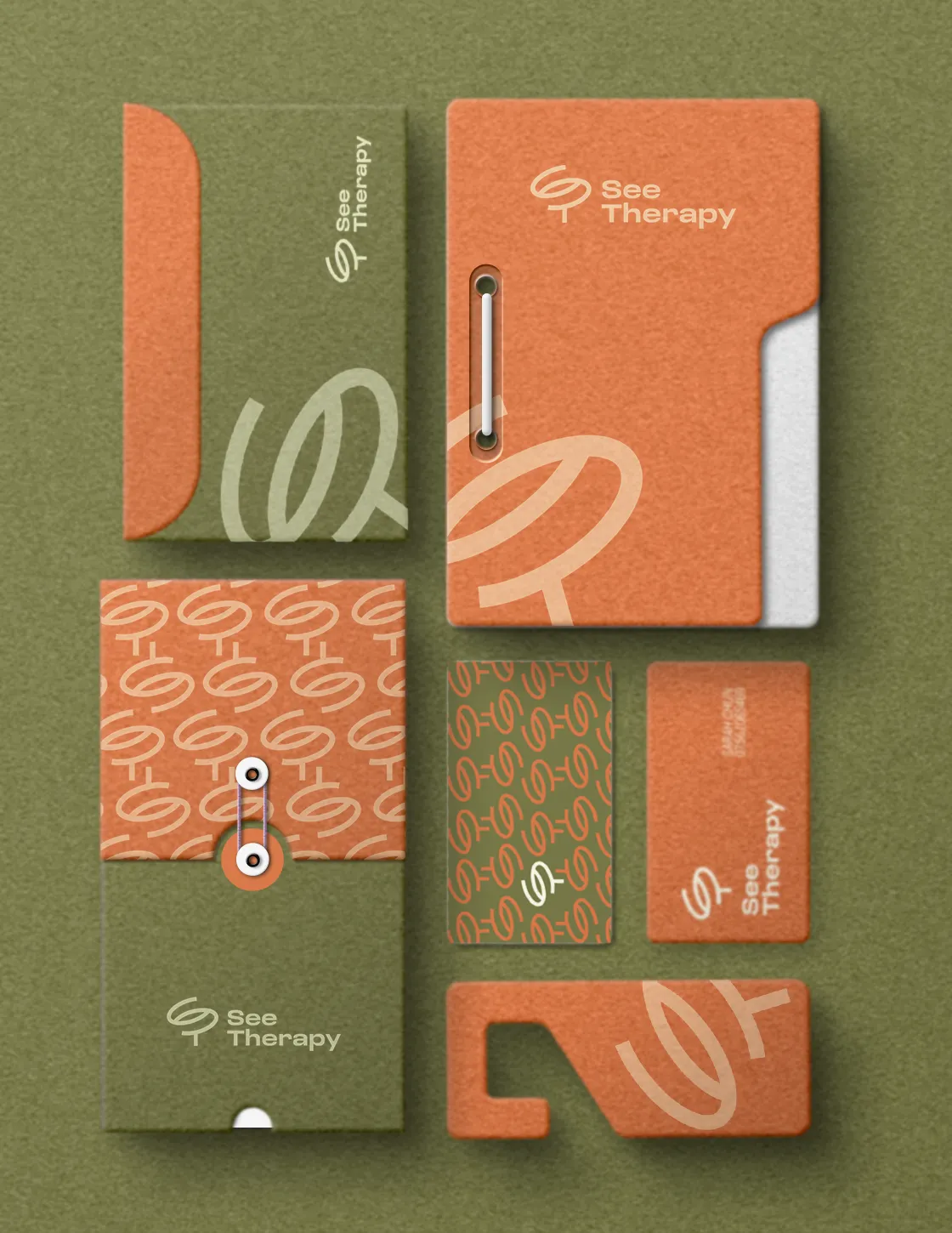
A brand identity for See Therapy, a counselling and art therapy practice run by Sarah Chun in Edinburgh and online.
The client
See Therapy offers art therapy and counselling to help people express what can’t always be said, under the line “When words are hard to find”. Its approach is collaborative, compassionate and built on conversation.
The mark
The logo is inspired by the letters S and T and a sprouting leaf. The owner feels that people are like seeds: you plant one and watch it grow.
Video not found: Logo Animation.mov
Colour
A warm, earthy palette: an orange like terracotta, an olive green like new growth, and a soft cream that lets both breathe.
Terracotta#D77D49
Olive#7A7A49
Cream#FFFEE2
Pattern
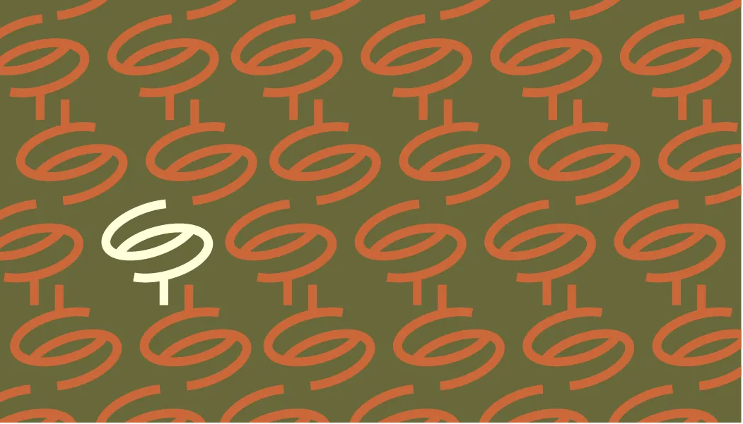
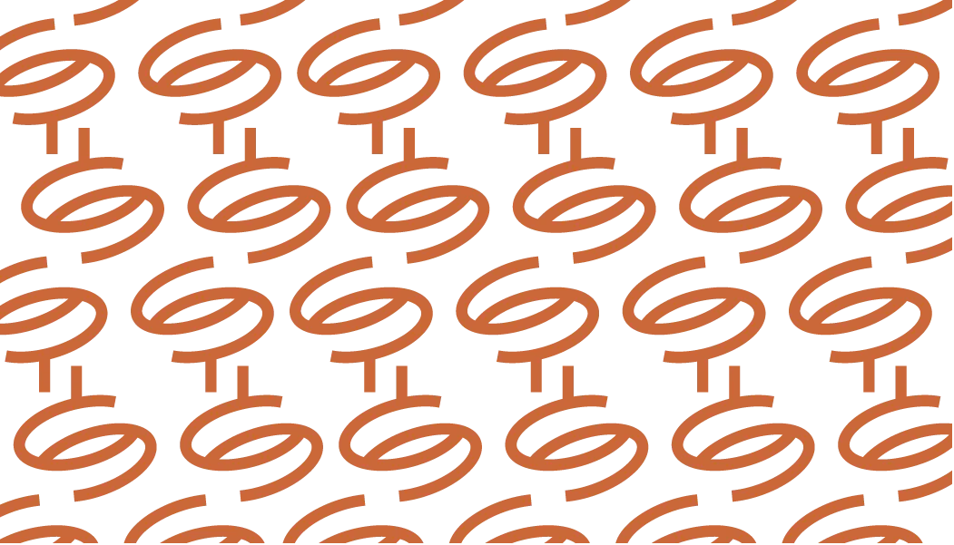
The sprouting mark repeats into a pattern for the stationery.