Onsentia
A brand identity for Onsentia, a mobile health platform born in research, built around a double asterisk mark for people, decentralised data and health.
The brand
Onsentia’s platform began within the world of research, addressing the complex challenges of technology, security, and information governance. With over 55 years of experience in mobile health, the team has led major collaborative programmes to break down these barriers, making health data more accessible and secure for all.
The mark
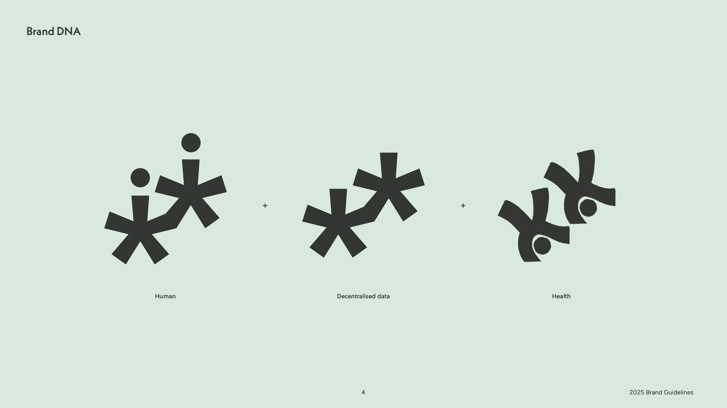
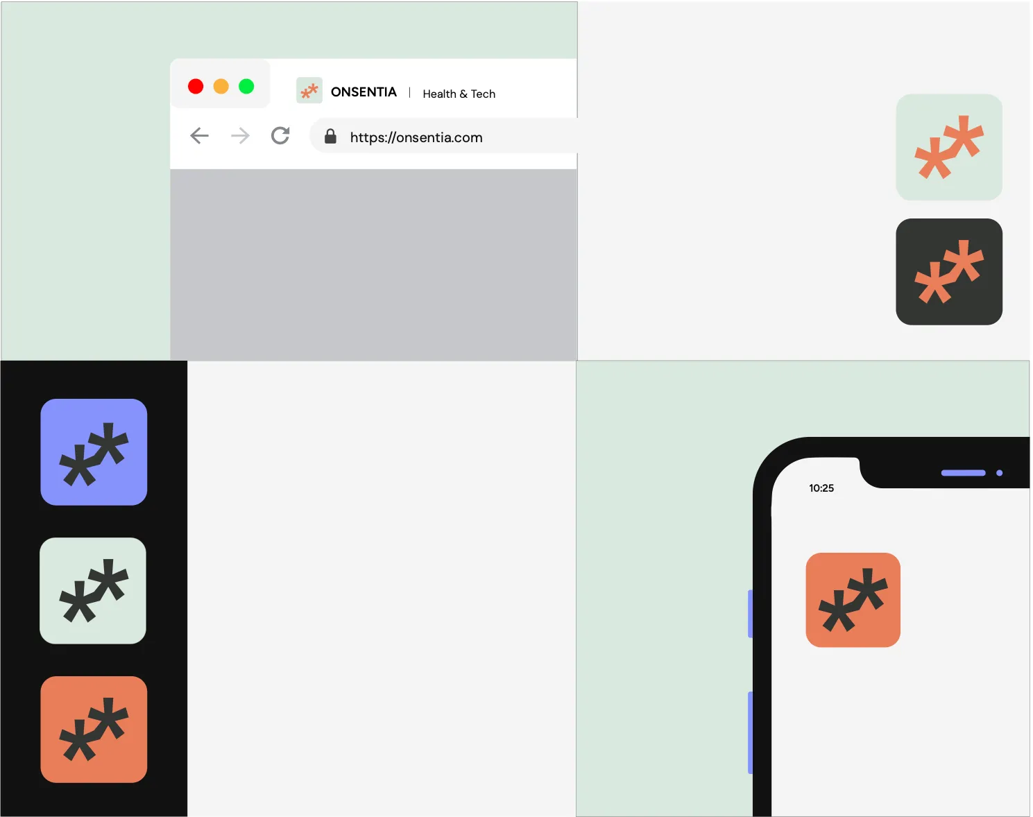
The double asterisk mark embodies Onsentia’s philosophy of connection and intelligence. It represents people at the centre of care, the flow of decentralised data, and the individual points of insight that, when linked together, create a fuller picture of health.
Colour
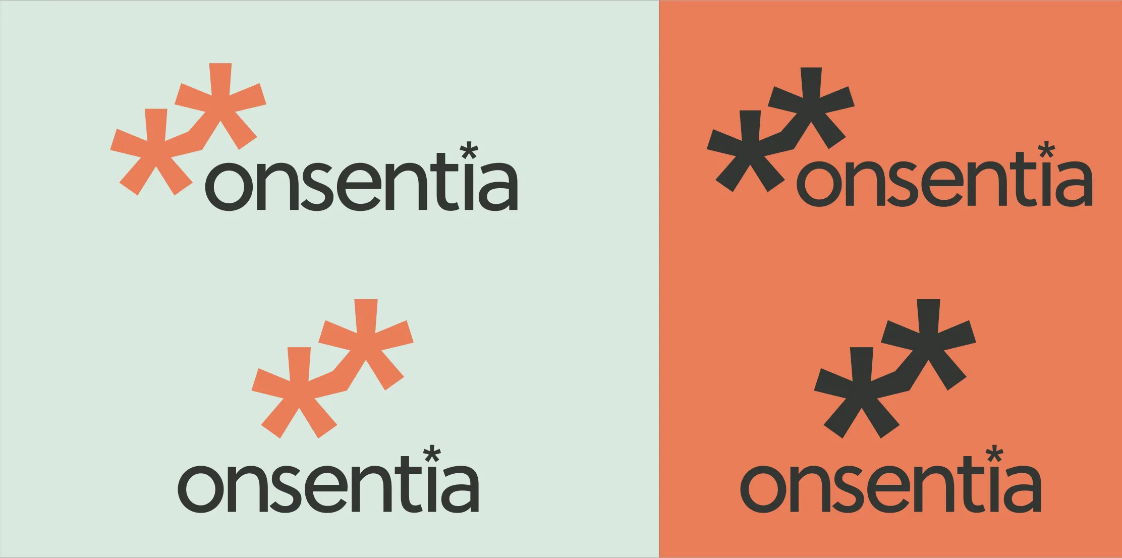
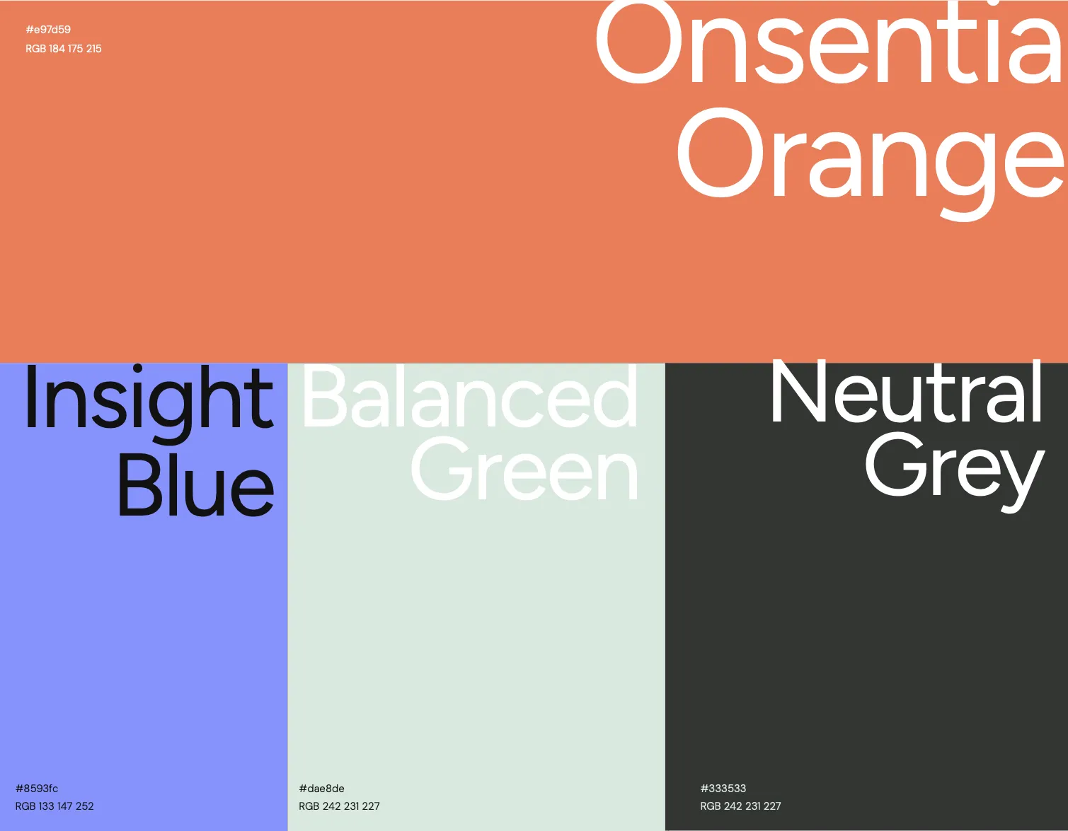
Vital Orange brings energy and human connection, while Insight Blue conveys clarity, reliability and research-driven intelligence. Balance Green adds a sense of wellbeing and harmony, and Foundation Grey grounds the brand in stability, professionalism and integrity.
Typography
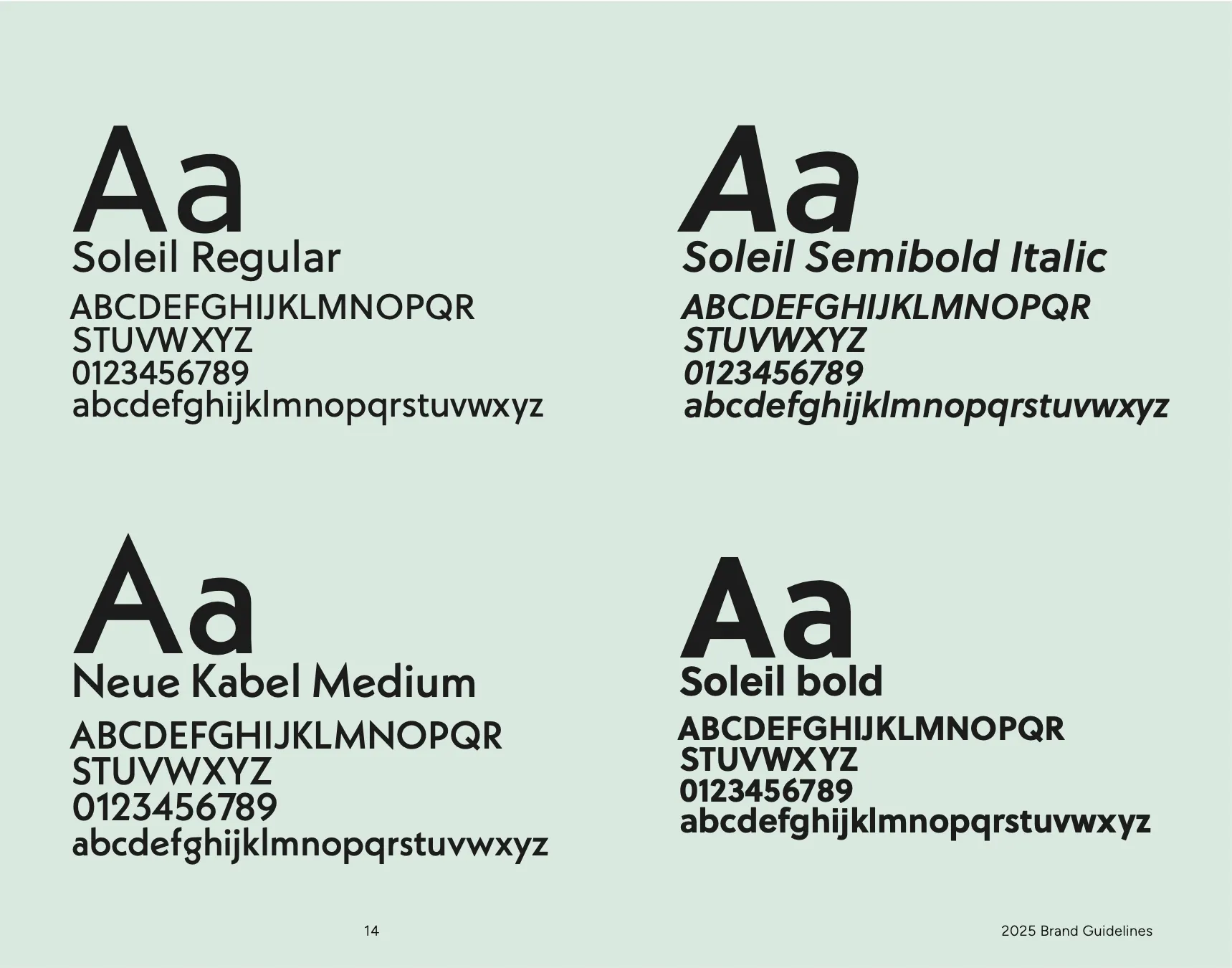
Soleil (modern, versatile, readable) is paired with Neue Kabel Medium (expressive, bold and characterful) for a balance of clarity and distinction. Soleil grounds the brand in professionalism and usability; Neue Kabel adds creative edge and memorability.
In use
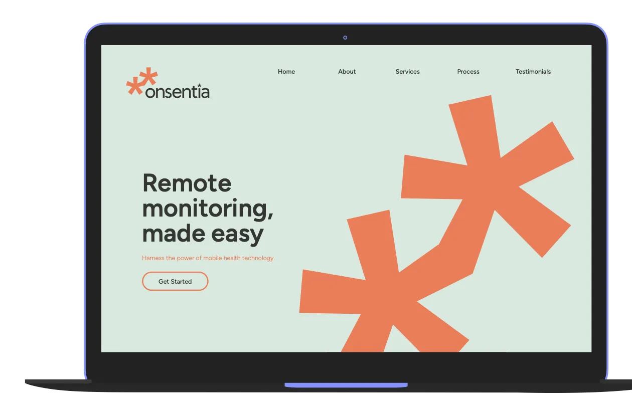
On the homepage, the large-scale asterisk motif draws attention and communicates Onsentia’s core values of connection and decentralised data, guiding visitors towards a clear next step.
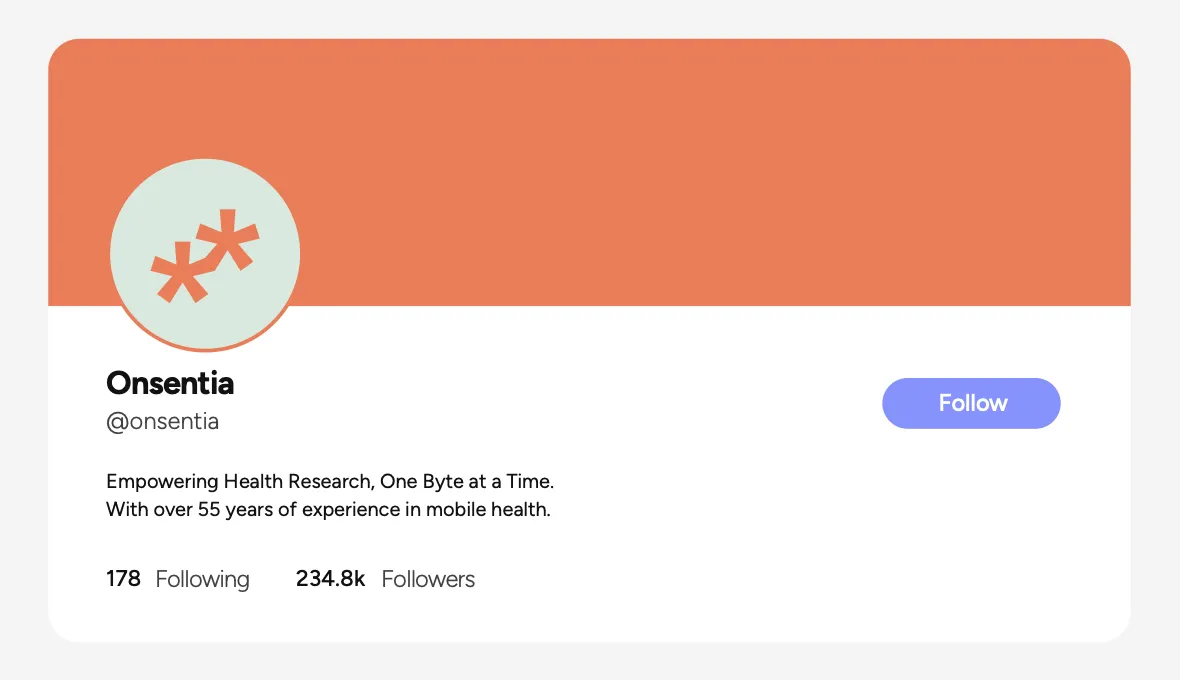
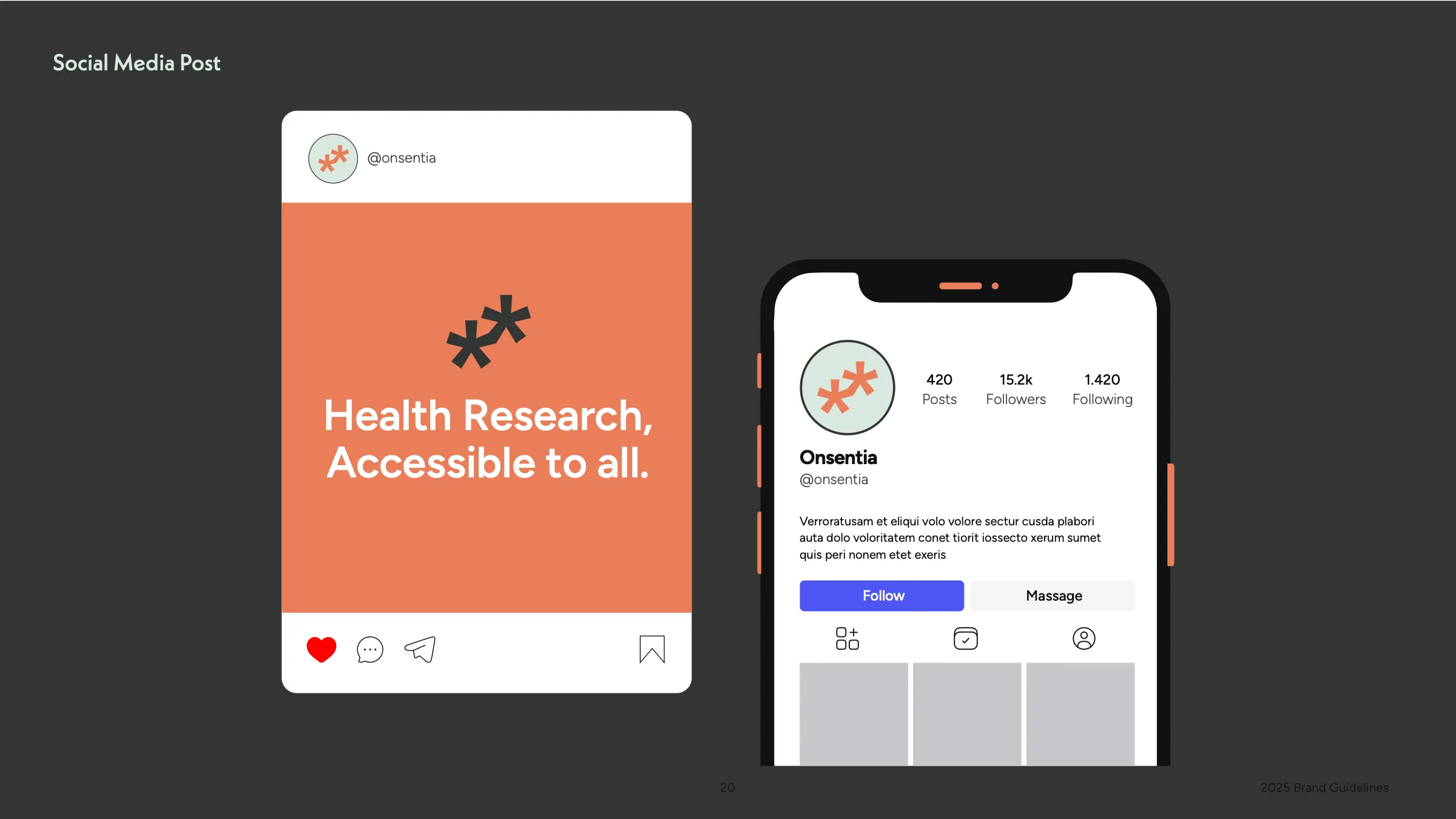
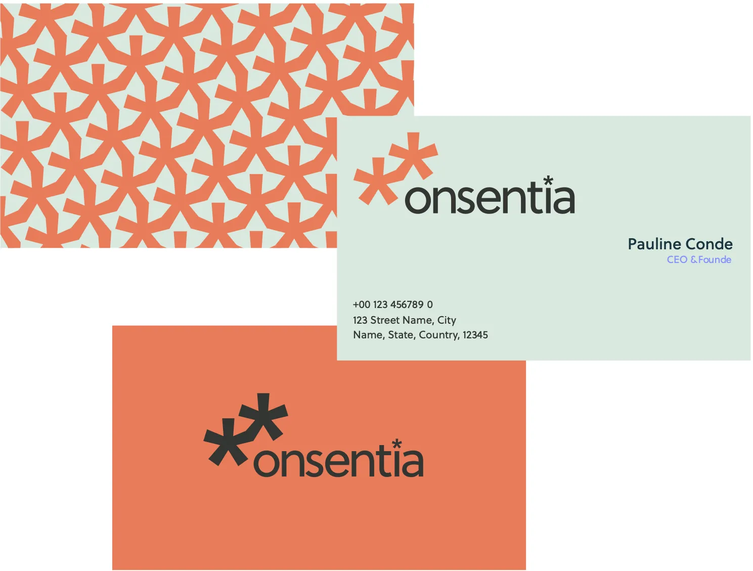
The business card uses a subtle pattern built from the double asterisk mark, symbolising decentralised data and interconnectedness, with a clean layout and generous white space so contact details are easy to read at a glance.